Picking the Best Watercolours for Urban Sketching
Picking the right watercolour palette is not an easy process, it's not quick and it's not simple. But that's great, because experimenting with different colours certainly is fun!
This video is slightly out of date, but features many of the colours I still use. It's worth checking out - but I'm due to bring out an update soon.
In this post I'm going to give you a lot of detail about the colours I use, but also give you options for a smaller budget or someone just starting out.
All my supplies are listed on THIS LINK
And if you want to read more about my pens and ink - click HERE
What watercolours are the best for loose urban sketching?
The simple answer to this, is any watercolour paints can be great for urban sketching. Or they can be horrible - the same paints in different artists' hands, or being viewed by different people can bring out different opinions, effects and emotions.
So there is no need to rush out and copy a whole palette BUT it is a great idea to be inspired by artists that you love, as their specific palette will say a lot about their sketching or urban sketching watercolour style.
The best sets of watercolours for beginners?
For beginner sketchers and urban artists seeking a reliable and affordable option, Cotman Watercolours by Winsor and Newton offer an excellent solution. So lets delve into the reasons why Cotman Watercolours are the best watercolor sets for artists in these categories.
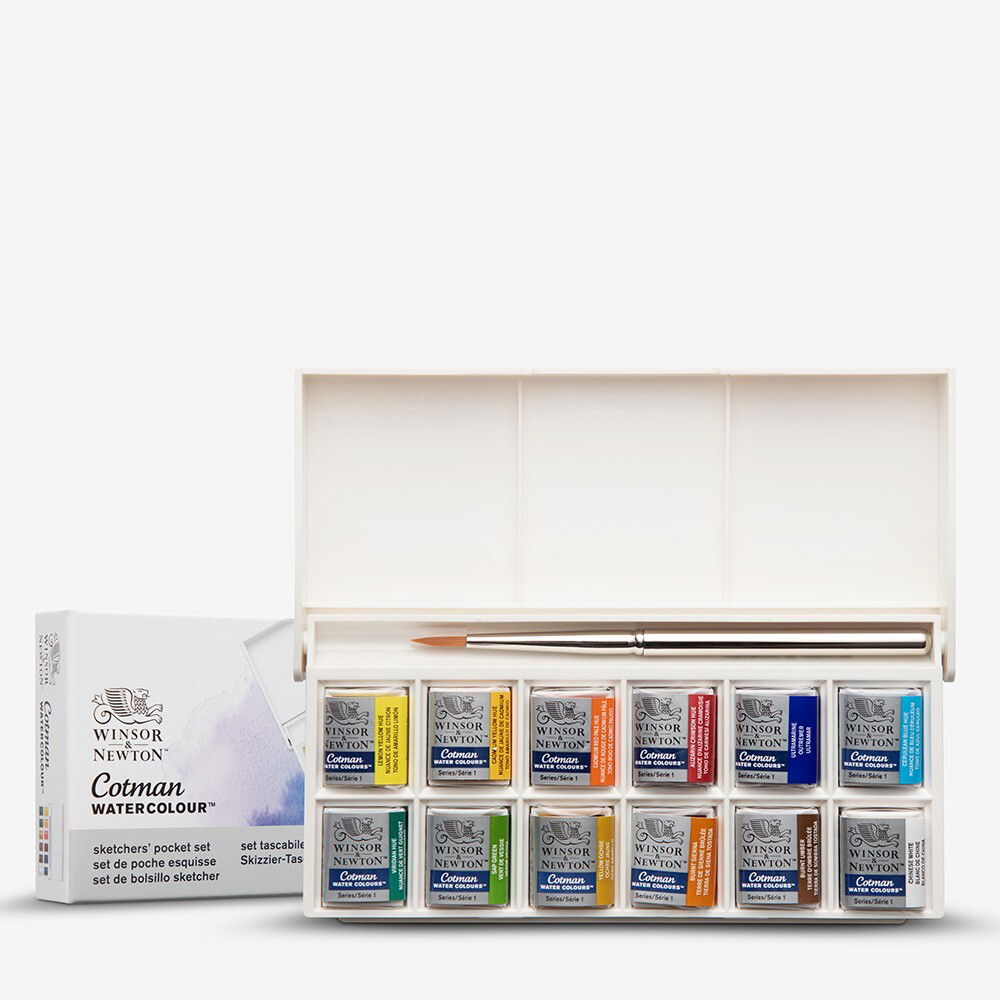
You can find this Cotman set via my affiliate link HERE at Jackson's Art.
Affordability: One of the key advantages of Cotman Watercolours is their affordability. As a beginner or urban sketcher, you may be conscious of your budget. Cotman Watercolours, produced by Winsor & Newton, provide a cost-effective entry point into the world of watercolor painting without compromising on quality. The sets are reasonably priced, making them accessible to artists at any stage of their artistic journey.
Portability and Convenience: Urban sketchers and artists who prefer sketching on-the-go will appreciate the portability of Cotman Watercolour sets. They come in a compact, lightweight palette, making them easy to carry in a backpack or pocket. This convenience allows you to take your art supplies wherever inspiration strikes, whether you're exploring a bustling cityscape or capturing the beauty of nature.
Sensible Color Range: Cotman Watercolours offer a comprehensive range of colors, providing beginner and urban sketchers with a diverse palette to choose from. The sets typically include essential colors, such as primary colors, earth tones, and popular hues, enabling artists to achieve a broad spectrum of shades and tones. This variety allows for versatility in capturing different subject matters, whether it's landscapes, architecture, or people.
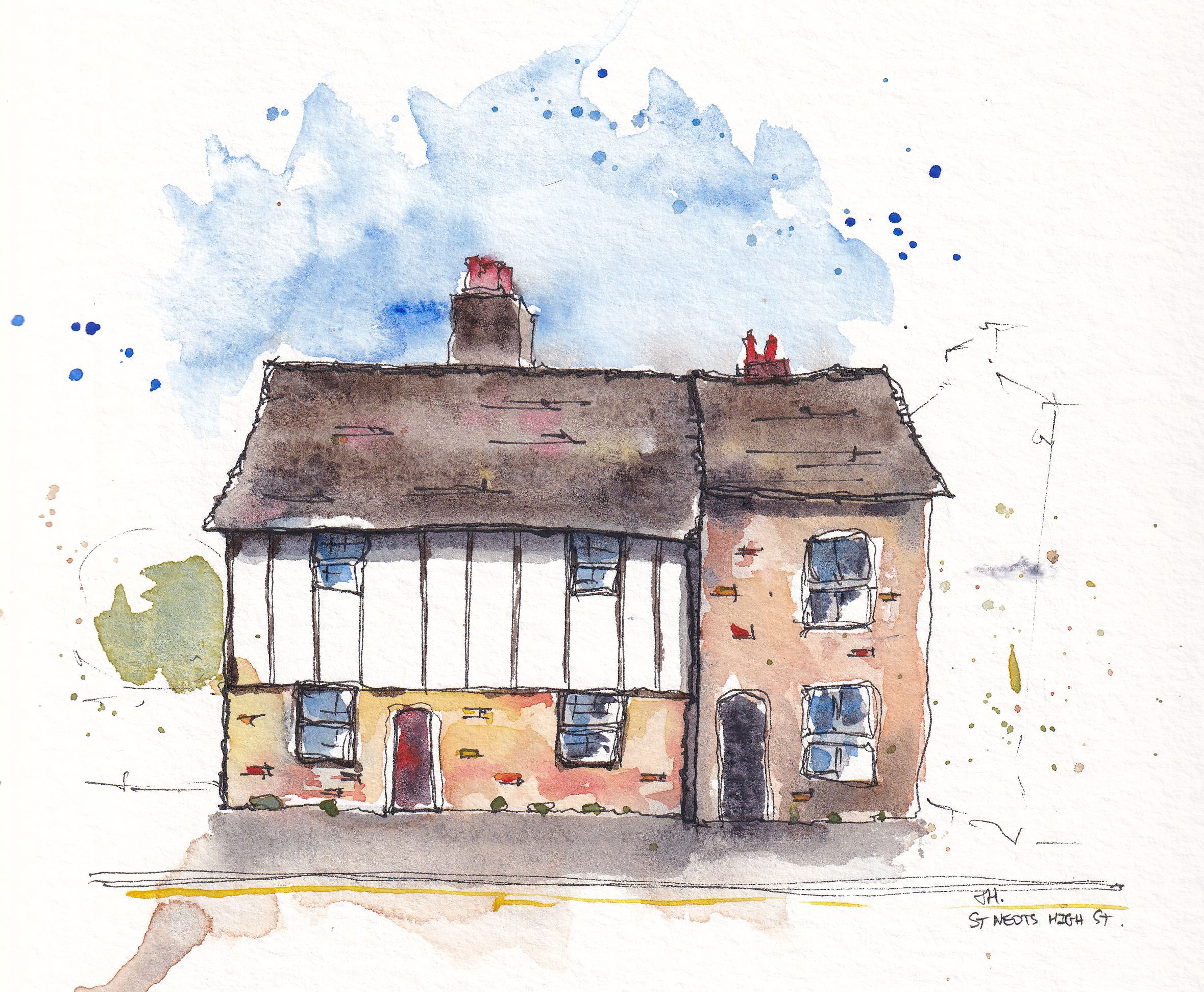
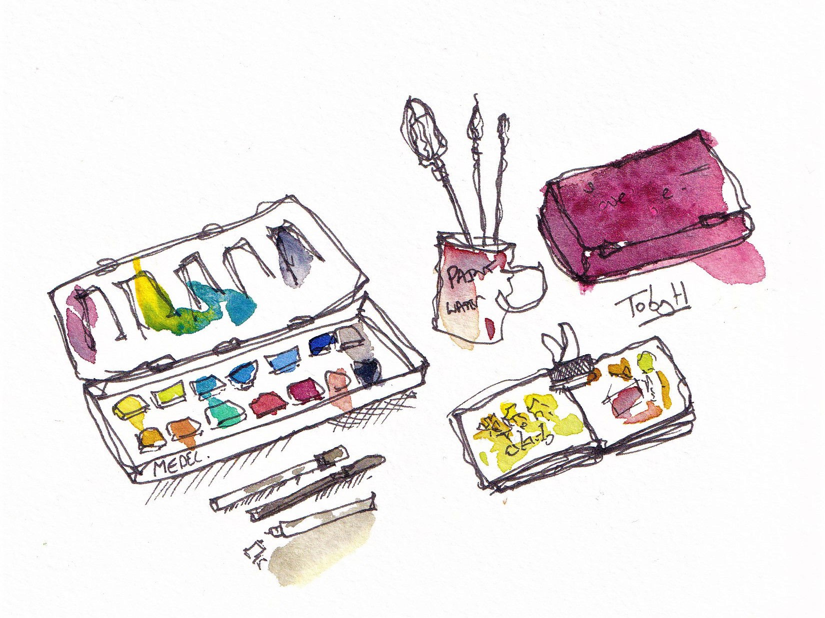
This little sketch is one of my earliest sketches as I was finding my style - it's completed with Cotman colours.
Reliable Quality: While Cotman Watercolours are more affordable than professional-grade watercolors, they still maintain a reliable level of quality. The pigments used in Cotman Watercolours are carefully selected to ensure vibrant and long-lasting colors. They offer good transparency, allowing artists to layer colors and create beautiful washes. The paints are easy to work with, even for beginners, providing a smooth and consistent application on paper.
Beginner-Friendly: Cotman Watercolours are specifically designed to cater to the needs of beginners and artists who are just starting their watercolor journey. The colors are easy to mix, making it simple for beginners to experiment and learn about color theory. The sets often include useful tips and techniques, providing guidance and inspiration for aspiring artists. Additionally, Cotman Watercolours are water-soluble, allowing for easy cleanup and maintenance of brushes and painting surfaces.
The Downsides? These are budget watercolours, so naturally they are less vibrant and often feel less exciting to use. Budget colours also have less details or reliability on granulation, permance and other aspects - and to keep the price down the formulations may change between batches leaving you uncertain where you stand.
You can find this Cotman set via my affiliate link HERE at Jackson's Art.
What about other brands? Or unbranded watercolour paints?
I never want to recommend anything I haven't personally used - and this Cotman set is how I started, before moving on to more expensive 'Artist' or 'Professional' grade colours.
I'm sure that there are plenty of other good brands out there though - so my advice is find something affordable, and gradually build from there!
This sketch used an unbranded set of watercolours by SketchBox - I was pleasantly surprised by the quality and usability. They paid me to create a tutorial for them, but I get no further reimbursement if you choose to visit their site.
How to develop your own palette?
Developing your own watercolour palette can be an exciting and personal journey that allows you to explore your unique artistic style and preferences. Here is a step-by-step guide on how to develop your own watercolour palette starting with a basic set like Winsor & Newton Cotman and gradually expanding it with new colors from premium ranges while also experimenting with other options:
Start with a Basic Set: Begin by acquiring a basic watercolor set like Winsor & Newton Cotman. These sets typically include essential colors such as primary colors (red, blue, yellow), earth tones, and possibly a few additional hues (the technical term for 'colour'). This will provide you with a foundation to start exploring and practicing watercolor techniques.
Understand Color Theory: Familiarize yourself with color theory, which explores how colors interact and blend together. Learn about primary, secondary, and tertiary colors, as well as warm and cool tones. This knowledge will help you make informed choices when expanding your palette.
A particularly good way to start expanding your palette is by finding pairs of primary colours - one warm and one cool - this expands your range hugely!
Colour theory is something I cover in my SketchLoose course - 'Advancing Tone, Colour and Value' - check it out on my course website - www.sketchloose.co.uk
Identify Colors to Add: As you gain experience and confidence, you can begin adding new colors to your palette. Research and experiment with premium watercolor ranges from reputable brands like Winsor & Newton, Daniel Smith, or M. Graham. Look for colors that complement and enhance your existing set, filling in any gaps in your color range or providing unique characteristics.
Consider Color Mixing: When selecting new colors, think about how they will interact with the ones you already have. Look for colors that can be mixed with your existing palette to create a wider range of hues. For example, adding a cool blue to your warm primary colors can expand your options for creating greens and purples.
Gradually Introduce New Colors: Introduce new colors slowly to your palette, one or a few at a time. This will allow you to familiarize yourself with each new color and understand its characteristics. Experiment with mixing them with your existing colors to discover their potential and create unique blends.
Experiment with Different Brands and Pigments: Explore watercolor paints from various brands and experiment with different pigment types. Each brand and pigment has its own unique properties, such as transparency, granulation, staining, and lightfastness. Trying out different options will help you understand the effects and possibilities each offers.
I mostly use Daniel Smith - these are more vibrant, highly granulating, have a huge range and are very reliable. They also rewet very nicely, and they use the same formulation in their tubes and their pans meaning you always know what you're getting.
My full list of watercolours can be found HERE with affiliate links - or head down below to find out more.
Regularly Evaluate and Adjust: Periodically evaluate your palette to assess the colors you use most frequently and those that may be redundant. Over time, you may find that certain colors no longer serve your needs or that you need additional options for specific subjects. Adjust your palette accordingly to create a more personalized and efficient set of colors.
Remember, developing your watercolor palette is a personal journey, and there are no right or wrong choices. Experiment, explore, and allow your artistic intuition to guide you. Enjoy the process of discovering new colors, techniques, and possibilities that will help you express your unique artistic vision through watercolor painting.
What watercolour paints do I use right now?
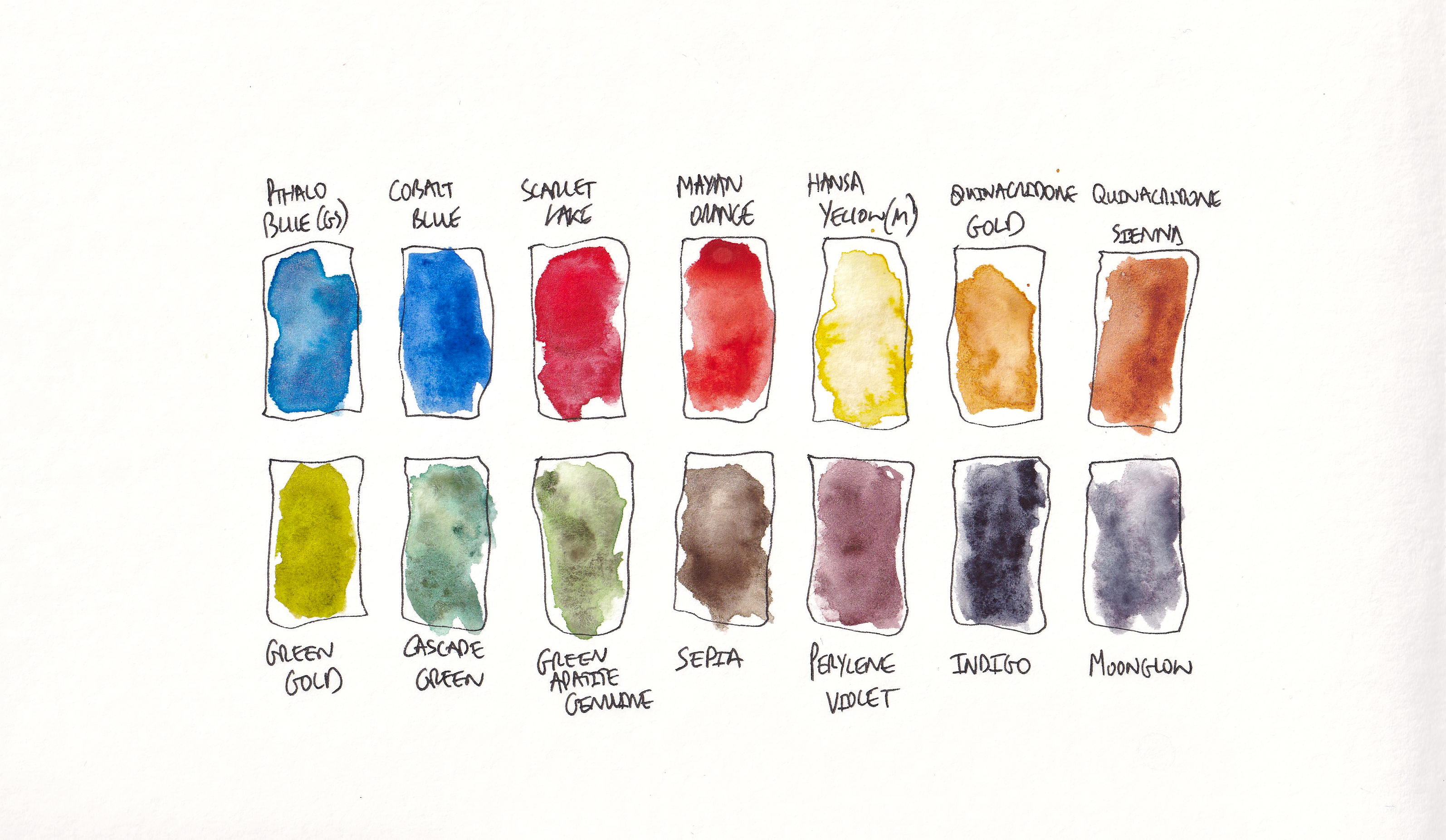
Here is my latest palette - I'm going to give you way more information down below!
Links to 15ml tubes - the most cost-efficient way of painting
| Colour | Brand | Link |
| Pthalo Blue | Daniel Smith | Click here |
| Cobalt Blue | Daniel Smith | Click here |
| Scarlet Lake | Winsor Newton (5ml only) | Click here |
| Mayan Orange | Daniel Smith | Click here |
| Hansa Yellow (med) | Daniel Smith | Click here |
| Quinacridone Gold | Daniel Smith | Click here |
| Quinacridone Sienna | Daniel Smith | Click here |
| Green Gold | Daniel Smith | Click here |
| Cascade Green | Daniel Smith | Click here |
| Green Apatite Genuine | Daniel Smith | Click here |
| Sepia | Daniel Smith | Click here |
| Perylene Violet | Daniel Smith | Click here |
| Indigo | Daniel Smith | Click here |
| Moonglow | Daniel Smith | Click here |
Links to 5ml tubes - cheaper, but more expensive per ml
| Colour | Brand | Link |
| Pthalo Blue | Daniel Smith | Click here |
| Cobalt Blue | Daniel Smith | Click here |
| Scarlet Lake | Winsor Newton | Click here |
| Mayan Orange | Daniel Smith | Click here |
| Hansa Yellow (med) | Daniel Smith | Click here |
| Quinacridone Gold | Daniel Smith | Click here |
| Quinacridone Sienna | Daniel Smith | Click here |
| Green Gold | Daniel Smith | Click here |
| Cascade Green | Daniel Smith | Click here |
| Green Apatite Genuine | Daniel Smith | Click here |
| Sepia | Daniel Smith | Click here |
| Perylene Violet | Daniel Smith | Click here |
| Indigo | Daniel Smith | Click here |
| Moonglow | Daniel Smith | Click here |
More DETAILS on my colours!
- Pthalo Blue:
- Brand: Daniel Smith
- Pthalo Blue is a vibrant, intense blue color. It has a strong tinting strength, meaning a little goes a long way. It is commonly used for creating bright skies, tropical waters, and as a primary blue for mixing.
- Cobalt Blue:
- Brand: Daniel Smith
- Cobalt Blue is a classic, deep blue color. It has a soft, subtle quality and is often used for painting skies, water, and landscapes. It is a versatile color that can be used on its own or in mixtures.
- Granulation: Cobalt Blue typically exhibits low to moderate granulation.
- Scarlet Lake:
- Brand: Winsor Newton
- Scarlet Lake is a bright, intense red color. It is commonly used for vibrant floral paintings, as well as for creating warm, rich skin tones.
- Mayan Orange:
- Brand: Daniel Smith
- Mayan Orange is a warm, orange color that resembles the hues found in Mayan art and artifacts. It is often used to depict sunsets, autumn foliage, and fiery elements in paintings.
- Granulation: Mayan Orange may exhibit some granulation, this is normally moderate.
- Hansa Yellow (med):
- Brand: Daniel Smith
- Hansa Yellow (med) is a medium yellow color with a bright, clean appearance. It is useful for mixing a wide range of colors and is often used for depicting sunlight, flowers, and natural landscapes.
- Quinacridone Gold:
- Brand: Daniel Smith
- Quinacridone Gold is a warm, golden yellow color. It is a versatile pigment that can be used for a variety of applications, including landscapes, florals, and portraits. It has a transparent and intense nature, allowing for vibrant and luminous effects.
- Quinacridone Sienna:
- Brand: Daniel Smith
- Quinacridone Sienna is a warm, earthy brown color with reddish undertones. It is often used for creating rich, warm skin tones, landscapes, and autumnal scenes. It has a transparent quality and can be mixed with other colors to achieve various effects.
- Green Gold:
- Brand: Daniel Smith
- Green Gold is a vibrant, yellow-green color. It is commonly used for depicting foliage, landscapes, and natural scenes. It has a transparent nature and can be mixed with other colors to create a range of green shades.
- Cascade Green:
- Brand: Daniel Smith
- Cascade Green is a mossy green color that is often used for depicting foliage, landscapes, and natural elements. It offers a fresh, vibrant appearance and can be mixed with other greens or colors to create various shades.
- Granulation: Cascade green granulates and splits into different hues, with a lovely blue undertone.
- Green Apatite Genuine:
- Brand: Daniel Smith
- Green Apatite Genuine is a unique green color with a natural, earthy appearance. It is often used for landscapes, botanical subjects, and creating harmonious color schemes. It offers a range of green tones and can be mixed with other colors for added versatility.
- Granulation: Green Apatite Genuine is known for its granulating properties, which can create texture and visual interest in washes.
- Sepia:
- Brand: Daniel Smith
- Sepia is a dark, warm brown color reminiscent of traditional sepia-toned photographs. It is often used for creating vintage effects, tonal studies, and monochromatic paintings. It has a transparent nature and can be used on its own or mixed with other colors.
- Perylene Violet:
- Brand: Daniel Smith
- Perylene Violet is a deep, rich violet color. It is often used for creating shadows, adding depth to floral paintings, and achieving a range of purple hues. Perylene Violet has a high tinting strength, meaning a small amount can create a significant color shift.
- Indigo:
- Brand: Daniel Smith
- Indigo is a dark blue color that resembles the traditional dye derived from the plant Indigofera tinctoria. It is often used for creating atmospheric effects, adding depth to landscapes, and achieving rich, deep blues. Indigo can be used on its own or mixed with other colors to create a range of blues.
- This colour, mixed with quinacridone sienna makes a deep neutral tone.
- Granulation: Indigo is known for its moderate granulation properties.
- Moonglow:
- Brand: Daniel Smith
- Moonglow is a unique color that combines blue, violet, and green hues. It is often used for painting moonlit scenes, twilight skies, and creating a sense of mystery in artworks. Moonglow offers a range of subtle, muted colors and can be used on its own or mixed with other colors for added depth and complexity.
- Granulation: Moonglow is known for its granulating properties, which can produce texture and visual effects reminiscent of lunar landscapes.
A note on other colours...I tend to slightly fiddle with my palette from time to time, so you might hear me mentioning some other colours.
- Van dyke brown - I have replaced this with Sepia, it's warmer and has a more lovely tone
- Indanthrone blue - I have replaced this with Indigo, which is much bolder and darker
- Moonglow - I still use this, but please note it is the only colour here which has an element of being not-light fast. It has three pigments in it, and the red tinge can fade with time, known as fugitive.
- Transparent pyrole orange - I have replaced this with Mayan Orange, which provides a more granular and deeper colour.
- Manganese blue hue - I have removed this, I have three other blues and moonglow (which has a blue-tinge) so it was simply unnecessary!